Web Design

Eric Meyer launched a redesign of his site a few days ago. The design is inspired by Hamonshu, Vols. 1-3, a Japanese book of wave and ripple designs, published in 1903. In his post, he talks about his inspirations and design process. The final result is beautiful with lots of small details and touches.
As a follow-up, he also posted his method to add pseudo-random illustrations with CSS as separators between entries on the site.
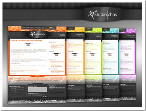
CSS3 support in browsers is bringing some exciting changes to web design and what is possible without jumping into Photoshop to make images and gradient backgrounds. During the redesign of studio|chris, I decided to take advantage of some of the new techniques for some of the buttons around the site.

I met Bonnie McCann of Photography by Bonnie a long time ago through the Digital Painting Forum. She lives in paradise in Kaneohe, HI which is literally a hop, skip and a jump from Honolulu. Given her location, Bonnie does a lot of tropical themed art and her photography ranges through nautical, aquatic, tropical and cultural themes. Stunning work – in fact, so stunning that she recently won the Grand Prize in the Artful Home’s 2008 Portfolio Competition!
In conjunction with her accomplishments, Bonnie decided it was time to toss out the old Flash template website she had been using in favor of a more classy and elegant interface that she could update quickly and easily and also included a blog and shopping cart system to sell her products online. In her list of requests for the new look was the light cyan that makes an appearance as the main content background color, a slight tropical feel (but remaining elegant) and to keep things as open as possible.
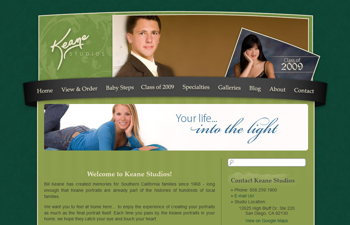
Bill Keane, owner of Keane Studios, LCC, heard me speak at WPPI back in March of this year when Marilyn called me up on stage during her program in the Silver Ballroom at Bally’s (I should really write about that sometime – it was an awesome experience!). After the conference, Bill contacted me to totally revamp his online presence. Bill’s old site was very simple, and according to him, didn’t really suit the “look” he’d like to put forward for his studio. He also wanted to be able to take advantage of blogging, which he wasn’t able to on his old site.
Bill’s requirements were for customers to be able to order portrait sessions on the site and we were to make use of his “signature green” and current logo. Along with the signature green, we also introduced a brand new green – the lighter green that serves as the background (I believe it was called Wasabi). Bill was great during the design process, providing color swatches, paper design patterns and samples of other websites he liked. Combining this all together, the final look combines the colors, logo, textures, and all of the other provided suggestions into a designed based on layered arcs, stripes and slightly textured backgrounds.
I recently had the pleasure of working with local artist Alice Rambo on the starter site for her new venture, Splash Designs. This is my third project with Alice. Previously, I’ve helped her create her logo, business cards and and an identifying flyer. All of them, if I say so myself, have turned out great, and Alice has been thrilled.
For her beginning website, Alice didn’t need anything very complex. She basically wanted something that introduced her to the community along with a few samples of her paintings. With her love of color and spontaneity, we started with a vibrant background taken from one of Alice’s abstract paintings, which matches the styling of one of the accent walls in her studio. On top of it, we’ve added various design elements taken directly from her business cards and other marketing materials along with her splashy logo and several paintings chosen by Alice.
Business Cards
Before the website, as mentioned above, Alice commissioned her business cards with the idea that they should be “fun” and have some representation of a splash to accompany her business’ name. Sure, we could have done a traditional paint splat, but that wouldn’t fit Alice’s larger than life personality. During an in-person consultation, we came up with a conceptual “splash” that does bring in some specks of a normal paint splash, but adds so much more with swirls and modern flourishes.
The end result is a card designed in Adobe InDesign CS3 for traditional one-color printing. For her first round, Alice chose to use a lively aqua-cyan ink (which ties into the color of her website background), and they look fabulous printed on a double-sided glossy card! She really likes the fact that as the blue cards begin to run out, or if she’s ready for a quick change, she can just have another batch printed in another color to keep things nice and fresh.
↑ Logo Side | Information Side ↓

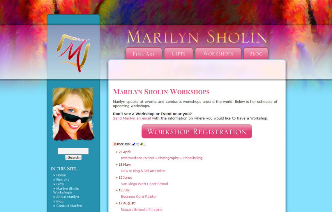
As all of you know by now, Marilyn and I work exceptionally well together, and as a result, we work together often. When Marilyn was ready to update her branding with a wonderful logo created by Charmaine Check at Check Studio, she came to me. The goal was for something refreshing, new and “Marilyn.” My first instinct was pink all over the place because Marilyn loves pink. It is a color that’s in all of her paintings, in every piece of marketing material I’ve seen from her, and of course the color she chooses to use as her daily skin color over at the Digital Painting Forum.
The first concept for her site is the same as above, but only in a rich set of pink and burgundy. She loved it, but always having had pink as a central color, decided it was time for a little change, something fresh. We played around with color palettes from a paint catalog (color inspiration is everywhere) and chose to keep pink as a strong accent, but opted for the blue and teal for the base design’s background. To make it more “Marilyn,” we used one of her most popular paintings [Bourbon Balcony] for a splash of color in the header.
The result is a contemporary, layered design that meets all of the goals we set out to accomplish. Now if only she could slow down enough so we can sit down and finish filling in all the content! Not to worry though, we have it on our to-do lists [along with plans for more expansion]. An artist’s work is never done!
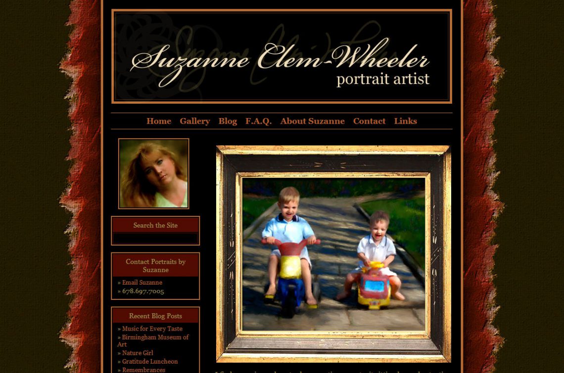
Suzanne is a portrait artist from the Atlanta, GA area who uses modern digital tools to create one-of-a-kind portraits for clients. I met Suzanne for the first time a few years ago at DigitalPaintingForum.com and over that bit of time, we’ve built an online friendship as well
As a little bit of history for Suzanne’s site, a little over a year ago, Suzanne was one of Studio|chris’ first clients. For the first iteration of her site, we worked together to create a static HTML site that effectively represented her brand; however, since it was all HTML updates were a little complicated.
Her host at that time offered a blog engine, so she did maintain a blog as well, but due to limitations set by the host, the look could not match her site. This wasn’t good from a branding standpoint because as her site visitors navigated around, if they clicked on her blog, they went from the richly colored, jewel-toned site to her blog which was tan and white. The blog, though on the same domain name, was like an entirely different planet from her main site. This can be confusing to users as they wonder if they’ve left the site they were viewing or not.
As a solution to those two problems, the new SuzanneClemWheeler.com now uses a customized WordPress-based system to manage her entire site, which makes her content simple to update and brings her blog into her site with a consistent look and feel. She decided to maintain the same look as her old site with a few minor changes, and it still works beautifully. With her new site in place, Suzanne is ready to take the world by storm with her portraits.
After the last redesign, I never imagined yet another redesign so soon, but with a few comments from visitors, I have to agree that it is that time again. The new design is a huge update and puts the focus where it should be — the content! Here’s a sneak peek of the new design:
I don’t have a release date set, and likely won’t set one, so it’ll be a surprise when the new look pops up! This is a very exciting update here, and my thanks go out to those who have watched through the progress of and commented on the initial design on the Digital Painting Forum and Painter Talk.
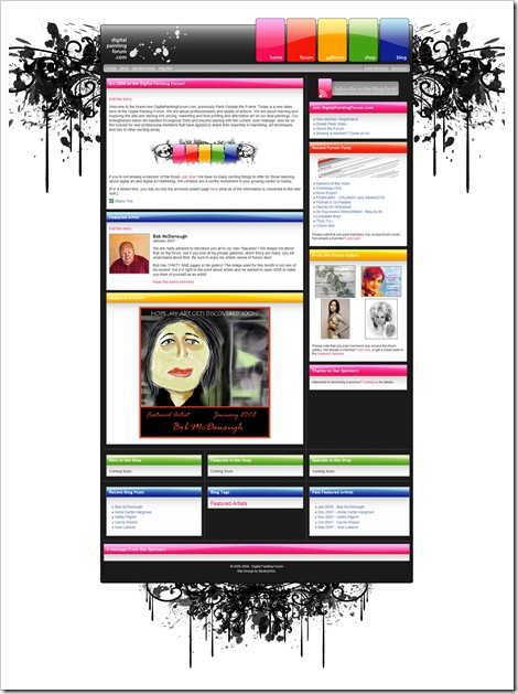
DigitalPaintingForum.com, previously known as Paint Outside the Frame (though it will always be POTF to the beginning members) has been a love of mine for a few years, since I found it for the first time in July 2005. I joined the site immediately after seeing the wealth of information and resources there. Of course, I shouldn’t have been surprised at the community there as it is Marilyn Sholin’s Forum for Artists and Photographers. Over the years, I’ve worked with Marilyn to help build the front end of the site, but the looks have always hinged on premade templates for the main section of the site, the forum. This time, we decided to take the board’s motto to heart and “Paint Outside the Frame” to create a drastically new, updated, fresh and colorful look for the entire site.
The preliminary design was a lot more simple, elegant with rounded corners and began to establish an artistic color theme for the site’s construction, but deep into the project, after pulling in many of the new elements into a test site we decided the entire look was a little less than spectacular (BORING!). So, I hit the drawing board once again trying to figure out a way to bring some punch and wow into the new design, while staying within some of the initial guidelines we had established. This happened only THREE DAYS prior to the scheduled unveiling, which took place on January 1, 2008! Not to fear though, we did unveil the most important section of the site on time, and with 5 colored skins, no less. The remainder of the site’s construction took place over the next week which is where we are today.
So far, the member’s response has been positive, and I am really happy with the way the site has turned out. Marilyn and I do have a couple of other sections to add and reformat to the new look, but those will come soon as some final bits of information pulled together. For now, I’d call the project a complete success. The Digital Painting Forum has a new look with lots of color and fun. The site will continue to grow as new plans are rolled out, and I, for one, am in love with the site even more and am very happy to be a part of the Digital Painting Forum team.
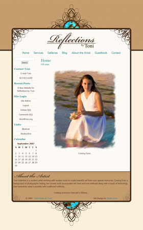
It’s that time once again. Another successful client site launch. Reflections by Toni, owned by Toni Valentine, offers portrait painting and photography services. Her work is timeless and classy, and as such, she wanted a website design that would convey those same feelings.
She admitted to me that she likes “cutesy” and whimsical, and she usually adds these elements to her clients’ proofs in the form of borders. As a result, we moved in that direction for her site by exploring custom made borders to use for the site that would effectively become branding elements for her Reflections by Toni brand. The main website border is the result of our efforts. It combines whimsical swirls presented in an elegant, symmetrical fashion with a touch of color in the turquoise accents that pull in some common colors from her paintings. The final result is a website that has an elegant look and complements her work flawlessly. Also included in her package was a set of borders specifically for use on her client’s proofs. By combining the site and these brand-new custom borders, the Reflections by Toni brand will surely begin to manifest itself in her clients’ and potential clients’ minds.
On another note, not related to the design, Toni had concerns of being totally in control of her own website, without having to spend hours and hours to update content or have to worry about the design or coding of newly created pages. Of course, I had an answer to that! Toni is set up on an adapted content management system that keeps everything super simple for her to control and update, and not have to worry about the design aspect because it has already been done! Keep your eye on the Studio|chris Shop for these setups to become available in the coming days. Until next time – back to designing!