CSS3 Metallic and Glossy Buttons Without Images
CSS3 support in browsers is bringing some exciting changes to web design and what is possible without jumping into Photoshop to make images and gradient backgrounds. During the redesign of studio|chris, I decided to take advantage of some of the new techniques for some of the buttons around the site.
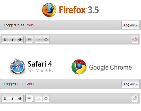
The most prominent examples in the visual design for regular readers are the drop and inset shadows in the comment sections and also some of the buttons throughout the site. Of the buttons, the most complex are the glass (in Firefox) or metallic (in WebKit-based browsers) buttons in the mini-editor used while posting a comment or over in the support forum.
These little beauties use progressive enhancement with CSS3 for rounded corners, gradient backgrounds and stacked shadows to create their background effects – no images! Well, almost no images, CSS isn’t magic and can’t draw icons easily.
Explaining the CSS
Firefox 3.5
- Uses a combination of multiple inset box shadows [
-moz-box-shadow] and RGBA color [rgba(r,g,b,a)] to create glossy transparent buttons. - Multiple shadows are achieved by adding a comma and simply typing in a new shadow, simple (don’t forget the
insetproperty). - The offset property of
–moz-box-shadowis used to position the shadow inside the button, allowing for the illusion gradient effect, but with the added benefit of the gradient following the contours of the box. - The use of RGBA color for the shadows makes the shadows partially transparent, leading to a much richer rendering.
- Changing the main color in the
backgroundCSS property will change the color of the buttons without having to recolor the shadows. - An RGBA color for the main background color will make true transparent glass, but won’t be supported in IE.
- The same technique may work with XUL and Firefox theming.
WebKit – Safari & Chrome
- Since WebKit doesn’t support the inset property for box shadows, yet, I opted to use
-webkit-gradientfor the background for WebKit browsers. - The final look isn’t as rich as the Firefox rendering, which follows the shape of the buttons, but it is a reasonable substitute.
- I didn’t use RGBA color for the gradient, so the background color can’t be changed easily; however, the color stops in the gradient can be changed easily.
- I haven’t dug too far into the AIR-embedded WebKit, but this may also work for HTML AIR applications.
Internet Explorer
- Without CSS3 support for gradients, shadows or RGBA, IE renders plain gray buttons.
Final Thoughts
As the web continues to move forward and CSS3 support becomes more widely available these techniques will begin to show up in more places, and I’m really looking forward to it!
Of course, there is always the opportunity for the these properties to be misused, just like Photoshop filters. But I like to look to the brighter side, used thoughtfully and in the right places, they add just the right amount of decoration for a more beautiful web browsing experience for the end user and quicker development time for designers. I’ll certainly be using a lot more in client projects.
What are you looking forward to most in CSS3, and what are your favorite techniques that can be used now? Please, share in the comments.